Guidelines
Search is most commonly used to give users a way to find and jump to a destination, or narrow the content on a page. Oftentimes it should be a primary element on the page. There is often hint text to give the user an idea of what they can enter in the search field. An empty search field, or non-descriptive hint text (think “Search”) does not deliver a helpful or guiding experience to our users and is not recommended. Generally speaking, search should behave the same everywhere it’s used, unless it’s clearly designed to be used for a unique function.
Types
Search is available in four types: Search box, search suggest, expandable search indicator, and mobile search overlay.

Dimensions
The size of a search field can vary. But, generally speaking, the minimum height should be 44px. The width can vary, but there should be enough width to be able to see at least a few words of a user’s query. When search needs to be really prominent, a larger custom size can be created. But other custom size search fields within the same product should be considered. The user shouldn’t see too many variations on the search field within the same product.


• Input text: Averta Regular 16px #262626.
• Hint text: #262626; 40% opacity.
• Input text: Averta Regular 14px #262626.
• Hint text: #262626; 40% opacity.

Search on Mobile
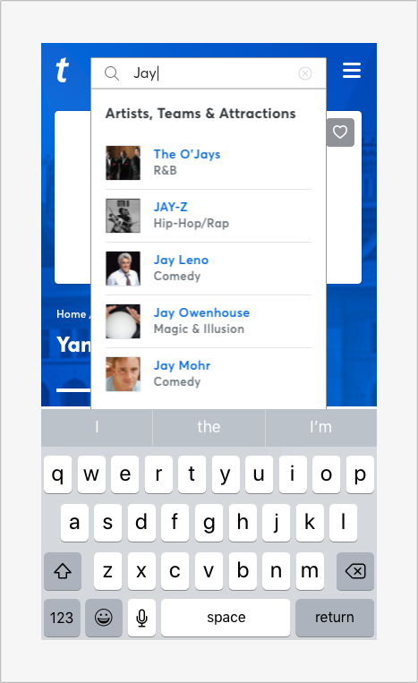
When activating search on mobile, search becomes a fullscreen overlay and the keyboard should appear. If the user sees search suggestions or recent searches, the designer can opt to hide the keyboard. To activate it, the user would have to tap in the search field again, so the content that’s shown should be useful and relevant.


Interaction
General: Once any text is entered into the search field, the hint text goes away. At any point, the user should be able to hit Enter to see their results (either inline or on a separate search results page). Clicking the search icon may also perform the same action as hitting Enter, or there can be a “Search” button. But either of these decisions should be made at the product level, not on a case-by-case basis.
Search as a Means of Filtering: As the user types, the content on the page (or within a specific area) narrows to match the search query.
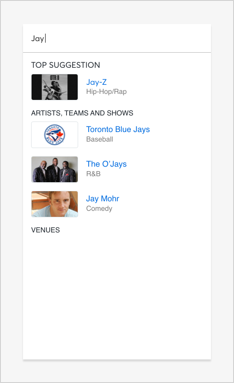
Search Suggest: As soon as the user clicks into the search field, the search suggest panel appears to show recent searches. When the user enters enough text to begin fetching matches, the matches appear in the search suggest container. Pressing Enter goes to a search results page, or the user can select one of the items in the search suggest list.
Minimized (Mobile) Search: When needed, search can be visually represented by a search icon. When the user clicks this icon, the search field appears and is in focus so the user can begin typing. This is particularly useful on mobile where space is needed.
Guidance
Here are a few examples of how best to use (and avoid using) search.

Use a search box height that is generally a minimum of 36px high.

Avoid search boxes less than 36px in height.

Use descriptive hint text to give the user an idea of what they can enter in the search field.

Avoid an empty search field or non-descriptive hint text.

Use a search bar width that allows for at least a few words of a user’s query.

Avoid making the search bar width so short it only allows for 2 words or less.
Use a fullscreen overlay when activating search on mobile.
Avoid using a dropdown for search suggestions in mobile.

Use a search design pattern with an open text-entry field next to the icon when possible. This makes the search easier to find and decreases the cost of interaction, especially when searching is a primary user action.

Avoid using an expandable search indicator when searching is a primary user action.


