Components
Inputs
Page Elements
Filters
Feedback
Usage
A toggle is a digital on / off switch. Toggle switches are best used for changing the state of system functionalities and preferences. Toggles may replace two radio buttons or a single checkbox to allow users to choose between two opposing states.
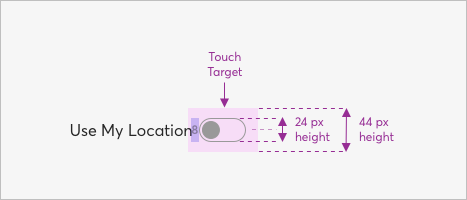
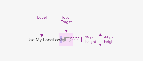
Sizes
24px Height
Use My Location
16px Height
Use My Location
Dimensions
Toggles come in 2 sizes and will fit both desktop and mobile use cases.
24px Height
16px Height
Guidelines
Sometimes deciding which user interface element to use — radio buttons, checkboxes, or toggles — can be difficult. When detremining which option will best fit your use case, consider the number and type of options, and if there is any clear default value. The below table summarizes questions and answers about these frequently used UI elements.
| Scenario | Radio Buttons | Checkboxes | Single Checkbox | Toggle |
|---|---|---|---|---|
How many options? | Multiple | Multiple | 1 | 1 |
How many selections? | 1 | 0 - all | 2 (on/off) | 2 (on/off) |
Is there a default option? | Yes | No | Yes | Yes |
What kind of choices? | Mutually exclusive | Independent | Mutually exclusive | Mutually exclusive |
When does the selection take effect? | After submit button | After submit button* | After submit button | Immediately |
* Filters activated by checkboxes may not require a submit button.
Example - Toggle Off
Example - Toggle On
When to use toggles
Use toggles to:
- Toggle a single option on or off
- Immediately activate or deactivate something
DO
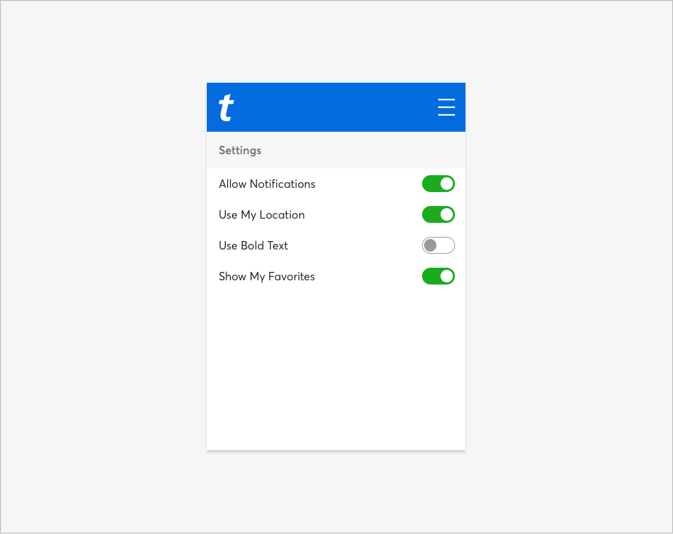
Use toggles to turn an option on or off, especially on mobile.
DON'T
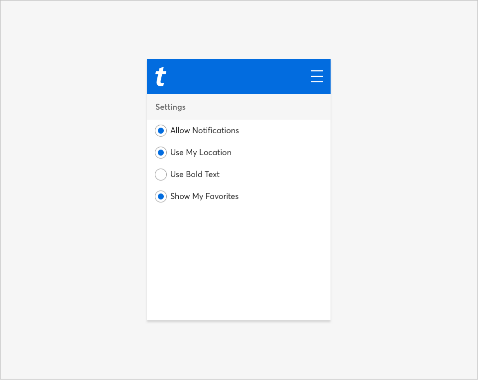
Don’t use radio buttons to toggle an option on or off.


