Flexible and Fast
Aurora is a React component library, meaning it’s a library made up of style components whose visual properties can be controlled through a single source of code. They contain visual style and behavior, but no specific content or functionality. This is perfect for components that require versatility.
Components that are used across multiple products with the exact same content structure and functionality should be converted into functional widgets. These widgets can be dropped into any product, but their content and functionality can be controlled through a single source of code.
A combination of style components and functional widgets make it possible for a global design team to collaborate and achieve consistency. And they make it possible for a large company to evolve quickly. All components are flexible and easy to work with — whether you’re a designer or a developer.
The Component Library
This library is a starting point, and contribution from designers and developers is encouraged. Our component library only comes to life and improves if designers, developers, and product managers all chip in and contribute to it.
Our component library can be categorized into three buckets: Unique, Shared, & Global.

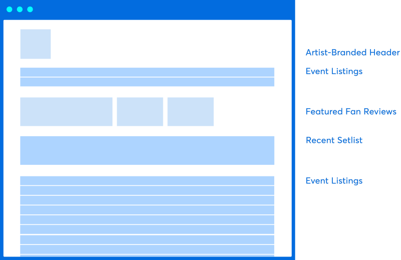
Unique
Shared
Global
How to Use the Component Library

For Developers
Use prop tables and code snippets in the Code section of each component page to include Aurora style components in your project. You can learn more about Styled Components here.
Refer to the GitHub repository for additional information. Read the Maintenance Guidelines to understand how code should be checked in and reviewed. When contributing to the library, please follow these Contribution Guidelines. And always follow the Code of Conduct.

For Designers
Use Lingo to bring design components into your Sketch files. Please remember to always check for updates by pulling the latest version and make sure your version of Lingo is always up to date.
Refer to the Usage tab of each component page for usage guidelines.
If you’re working on a new element that other teams might find useful, let your team and the component library leads know. Updates to the component library will be maintained by a select group of design leads across Marketplace and Enterprise.


