Usage Guidlelines
These guidelines are the framework upon which we have built our system for how color is used for Ticketmaster Product Design.
Brand
| Variable | Hex Value | Color | Roles | |
|---|---|---|---|---|
$primary | #026CDF | Azure | Links Buttons CTA’s Clickable Elements | |
$primary-dark | #0150A7 | Azure Dark | Button hover state | |
$primary-darkest | #013670 | Azure Darkest | Button pressed state | |
$primary-light | #D6E7FA | Azure Light | Info Feedback banner background fill | |
$primary-lightest | #EBF4FD | Azure Lightest | Table row hover state | |
$primary-reverse | #3396FF | Azure Reverse | Primary color on dark backgrounds | |
$primary-reverse-light | #80B5EF | Azure Reverse Light | Dark background primary fill | |
$primary-reverse-lightest | #BFDAF6 | Azure Reverse Lightest | Dark background primary fill | |
$dark-fill | #1F262D | Black Pearl | Background fill only | |
$dark-fill-light | #8F9296 | Black Pearl Light | Background fill only Badge background fill | |
$dark-fill-lightest | #E3E4E5 | Black Pearl Lightest | Background fill only Badge background fill |
Marketplace Accent
| Variable | Hex Value | Color | Roles | |
|---|---|---|---|---|
$accent-01 | #C56BFF | Heliotrope | Date stamp on dark background | |
$accent-01-dark | #904EBA | Heliotrope Dark | Text color; other limited uses | |
$accent-01-light | #F0DAFF | Heliotrope Light | Background fill; limited uses | |
$accent-01-lightest | #F9F0FF | Heliotrope Lightest | Background fill badges | |
$accent-02 | #962D94 | Cruz | Fan reviews | |
$accent-02-dark | #6D236C | Cruz Dark | Text color; other limited uses | |
$accent-02-light | #DFC0DF | Cruz Light | Background fill; limited uses | |
$accent-02-lightest | #F4EAF4 | Cruz Lightest | Background fill badges |
Enterprise Accent
| Variable | Hex Value | Color | Roles | |
|---|---|---|---|---|
$accent-03 | #14A1A3 | Turquoise | Event listing date lockup Section header in filter menus Selected state on filters | |
$accent-03-dark | #0A7E80 | Turquoise Dark | Data visualization Illustrations | |
$accent-03-light | #AADDDD | Turquoise Light | Data visualization Illustrations | |
$accent-03-lightest | #CEF2F2 | Turquoise Lightest | Data visualization Illustrations | |
$accent-04 | #00FFFF | Aquamarine | Used in gradients only |
Grays
| Variable | Hex Value | Color | Roles | |
|---|---|---|---|---|
$gray-01 | #262626 | Onyx | Black text = 100% opacity Gray text = 65% opacity Disabled text = 40% opacity | |
$gray-02 | #999999 | Slate | Border color: -Dropdowns -Filter Buttons -Search Fields -Input Fields | |
$gray-03 | #BFBFBF | Moonrock | Border color: -Lines -Page Containers -Tooltips -Pop Ups | |
$gray-04 | #EBEBEB | Diatomite | Background Fill | |
$gray-05 | #F6F6F6 | Quartz | Background Fill: -Behind Cards -Other White Elements * Non-functional gray | |
$gray-05 | #FFFFFF | White | Text on dark backgrounds |
Feedback
| Variable | Hex Value | Color | Roles | |
|---|---|---|---|---|
$error | #D93A3A | Ruby | Failure/Error states Error text | |
$error-dark | #A22B2B | Ruby Dark | Border color on error background fill | |
$error-light | #F3C3C3 | Ruby Light | Background fill color on feedback banner | |
$error-lightest | #FBEBEB | Ruby Lightest | Background fill color on badges | |
$alert | #F2BD2A | Amber | Warning states | |
$alert-dark | #C69A22 | Amber Dark | Border color on caution background fill | |
$alert-light | #FAE5AA | Amber Light | Background fill color on caution states | |
$alert-lightest | #FDF5DF | Amber Lightest | Background fill color on badges | |
$success | #1BAB1E | Emerald | Success states Special button | |
$success-dark | #148016 | Emerald Dark | Border color on success background fill | |
$success-light | #BAE5BB | Emerald Light | Background fill color on success states | |
$success-lightest | #E8F6E8 | Emerald Lightest | Background fill color on badges |
General
Colors serve specific purposes in TM Product Design and should adhere to the following guidelines.
DON'T

• Don’t use the brand color Black Pearl on Product UI (text, borders, grays).
• Never apply Feedback colors (Ruby, Amber and Emerald shades) to design elements outside of their designated roles.
• Never apply Feedback colors (Ruby, Amber and Emerald shades) to design elements outside of their designated roles.
DON'T
• Onyx is for text only. Do not use as a background color.
• Don’t have accent colors dominate the Product UI.
• Don’t have accent colors dominate the Product UI.
Accessibility
Users that have low vision and color deficiencies require sufficient contrast between foreground (text or graphics) and the background for readability. Always use color values that are clear and legible against colored backgrounds and images.
PASS
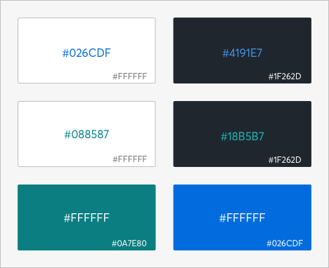
• Use a lighter shade of Azure (#4191E7) for text on Black Pearl background.
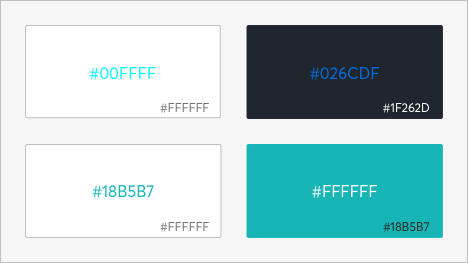
• A darker shade of Turquoise (#088587) may be used as a background or text on a white background.
• White type reads best on dark color backgrounds.
• A darker shade of Turquoise (#088587) may be used as a background or text on a white background.
• White type reads best on dark color backgrounds.
FAIL
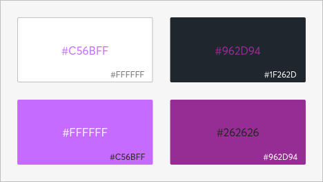
• Don’t use Heliotrope as text on white background.
• Don’t use Cruz for text on dark backgrounds.
• Don’t use white text on Heliotrope background.
• Don’t use black text on Cruz background.
• Don’t use Cruz for text on dark backgrounds.
• Don’t use white text on Heliotrope background.
• Don’t use black text on Cruz background.
PASS
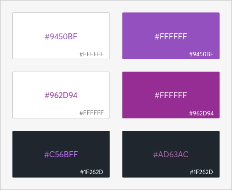
• A darker shade of Heliotrope (#9450BF) may be used for backgrounds or text on white backgrounds.
• Cruz may be used as a background or as text on white background.
• Heliotrope or a lighter shade of Cruz (#AD63AC) may be used on Black Pearl background.
• Cruz may be used as a background or as text on white background.
• Heliotrope or a lighter shade of Cruz (#AD63AC) may be used on Black Pearl background.
FAIL
• Don’t use Heliotrope as text on white background.
• Don’t use Cruz for text on dark backgrounds.
• Don’t use white text on Heliotrope background.
• Don’t use black text on Cruz background.
• Don’t use Cruz for text on dark backgrounds.
• Don’t use white text on Heliotrope background.
• Don’t use black text on Cruz background.
PASS
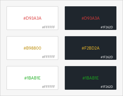
• Ruby, Dark Amber (#B98800), and Emerald may be used for text on white backgrounds.
• Ruby, Amber, and Emerald may be used as text on Black Pearl background.
• Ruby, Amber, and Emerald may be used as text on Black Pearl background.
PASS
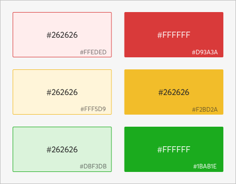
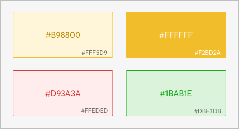
• Light shades of Ruby (#F3C3C3), Amber (#FAE5AA), and Emerald (#BAE5BB) may be used as backgrounds.
• Ruby, Amber, and Emerald may be used as backgrounds.
• Ruby, Amber, and Emerald may be used as backgrounds.
FAIL
• Avoid using Ruby, Amber, and Emerald as text over lighter shades of the same color.
• Don’t use white text on Amber background.
• Don’t use white text on Amber background.


