Icons
Icons are delightful, beautifully crafted symbols which we use to visually communicate core elements of a product and available actions. They are an important part of our brand, so we craft each icon according to our established standards, rather than pull them from third-party libraries.
Guidelines
System icons are a visual representation of an object, action or idea which provide more context and enhance usability.
Use Labels
The list of universally understood icons is extremely short - magnifying glass (search), house (home), printer (print) are a few. A myriad of factors such as age, app usage experience, culture and location play into the experience of each user, so an image may have different meaning to different people. Also, complex ideas can be very hard to depict with a single small image. To successfully establish a specific meaning for an icon, it’s very important to use it consistently and not use the same icon for more than one purpose. Employ icons sparingly and strategically throughout a designs.
Size
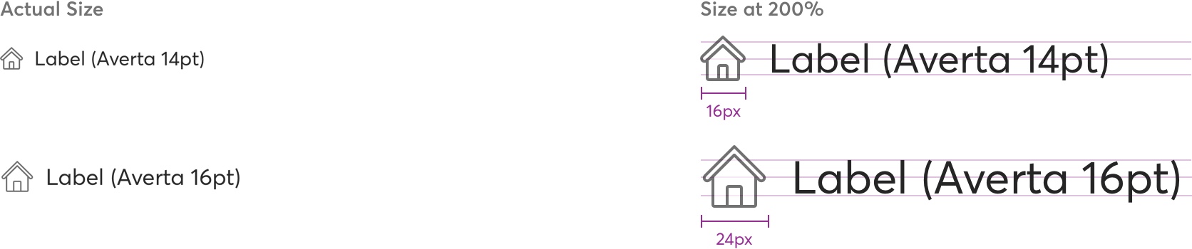
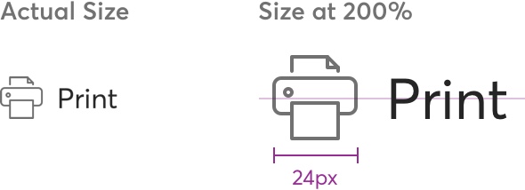
System icons can live within one of two container sizes: small (16px) and medium (24 px).
System icons can live within one of two container sizes: small (16px) and medium (24 px).
Use an icon at its original size and align it with the label.
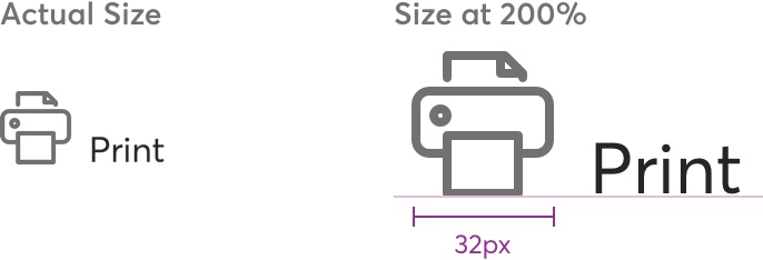
Avoid modifiying the size of an icon or align it to the baseline (or top) of the label.
Spacing
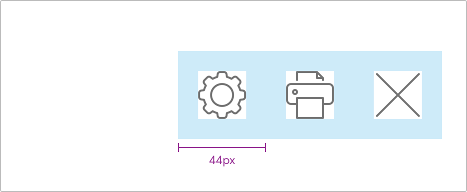
For touch surface interaction, an icon touch target should be at least 44px. Add consistent padding around the icon (it can be either 16px or 24px) to meet the 44px minimum.
Provide enough spacing for legibility and usability.
Avoic overlapping the touch target areas.
States
When icon is used to execute an action.
Enterprise accent (#14A1A3; opacity 100%)
Marketplace accent (#962D94; opacity 100%)
Color
All icons’ strokes are filled by default to gray (#262626; opacity 65%). Gray is the default color option for white backgrounds in most contexts. An icon’s stroke fill can be changed to any other color in the TM Product color pallete for other situations like dark backgrounds or mixed contexts where black or primary colors are desired. Use color semantically and reflect the importance of the icon’s action, while keeping the contrast high.
Icon with action label.
Use white (#FFFFFF; opacity 100%) on dark backgrounds.
Icon with action label.
Use a single color (gray on white is most common).
Avoid using more than one color.
Indicators
Actions
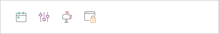
Objects
Feedback
Other


